Color Psychology for Creatives: 4 Unexpected Palettes That Change How a Story Feels
Don’t let color come last.
Alright, let’s talk about color. And not the “blue means sad, red means angry” kind of stuff you learned in art class. I’m talking about the subtle, mind-twisting, emotional magic of color. The kind that can make your audience feel something before they even hear a word.
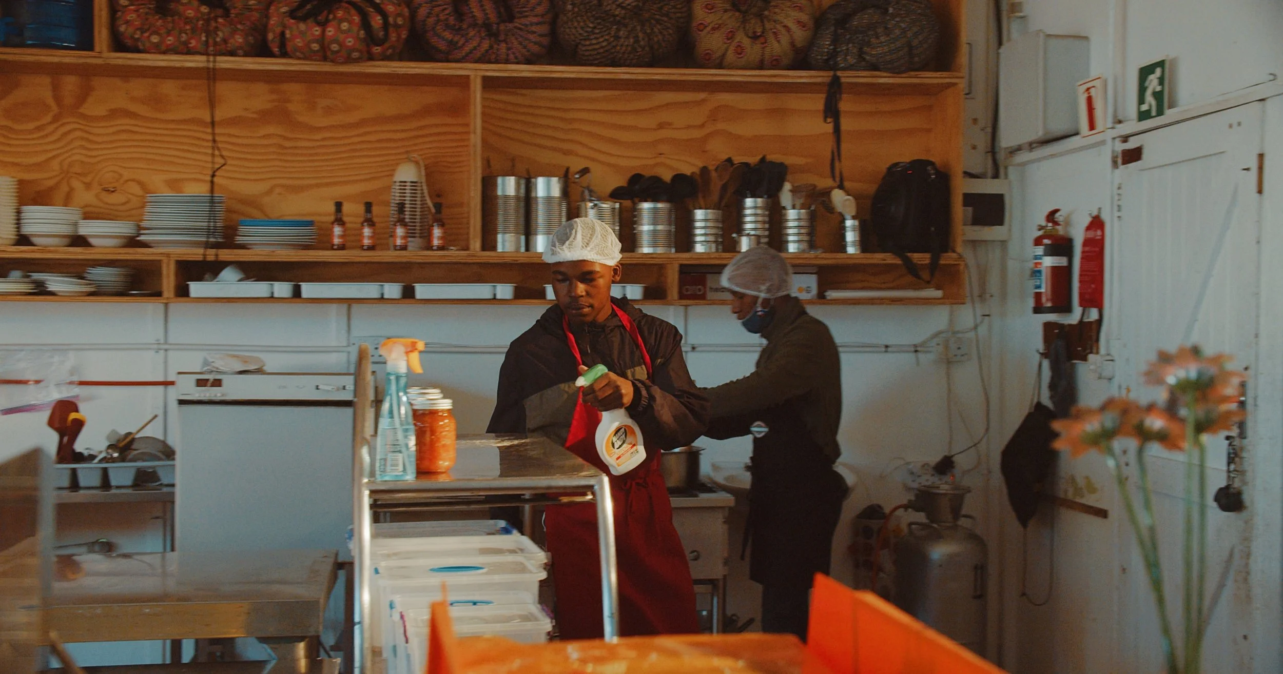
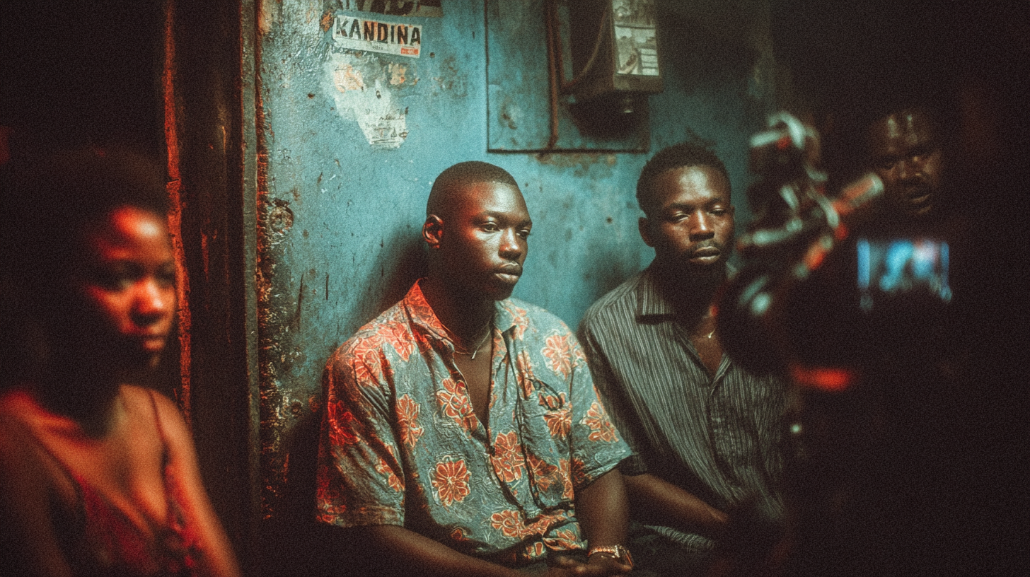
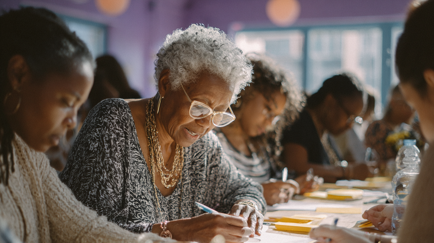
When I’m shooting documentaries, especially in Black and African communities, color isn’t just decoration. The right palette can show a community’s mood, underline joy in a scene that might otherwise go unnoticed, or help an audience feel the intention of a story.
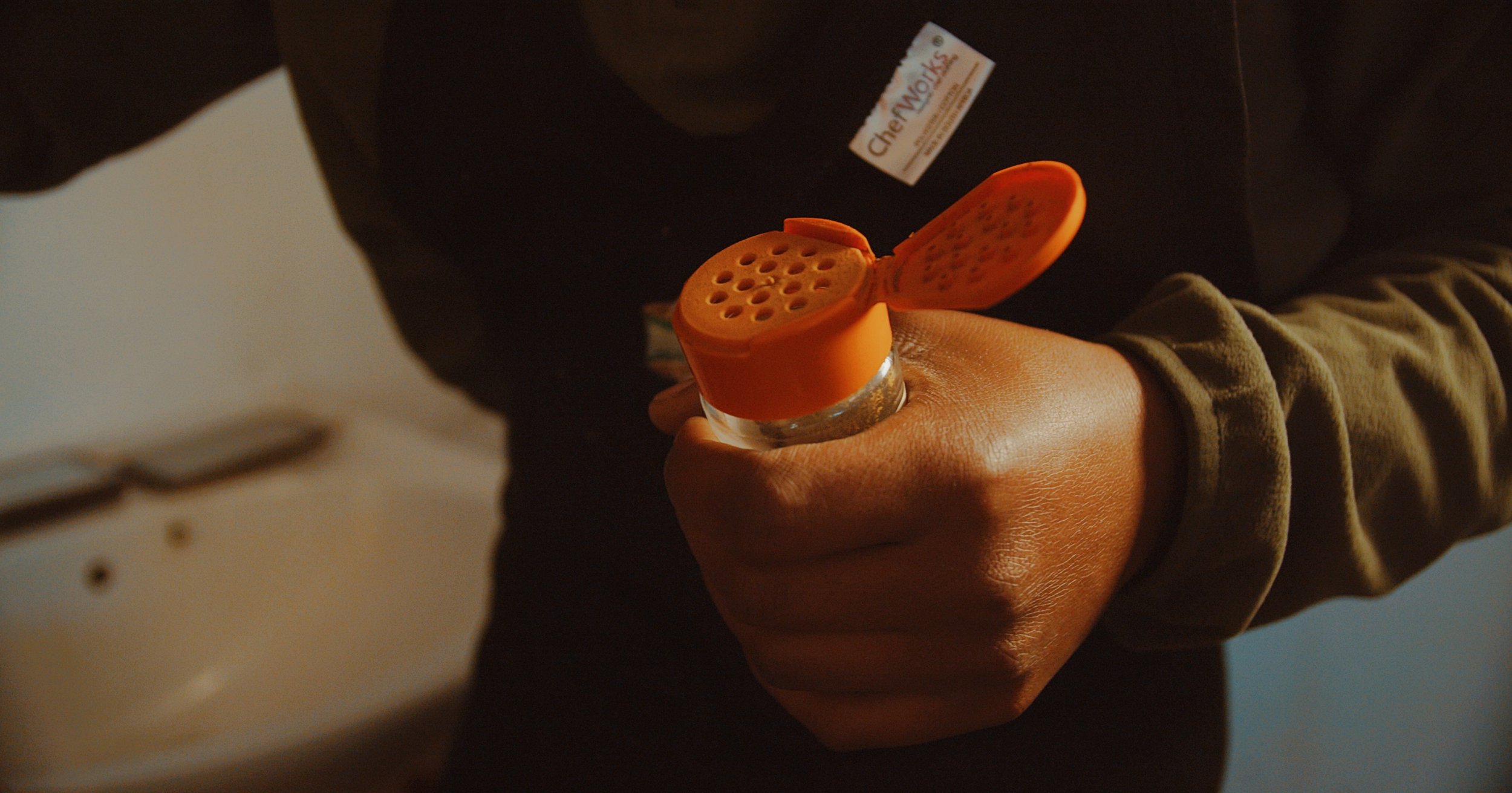
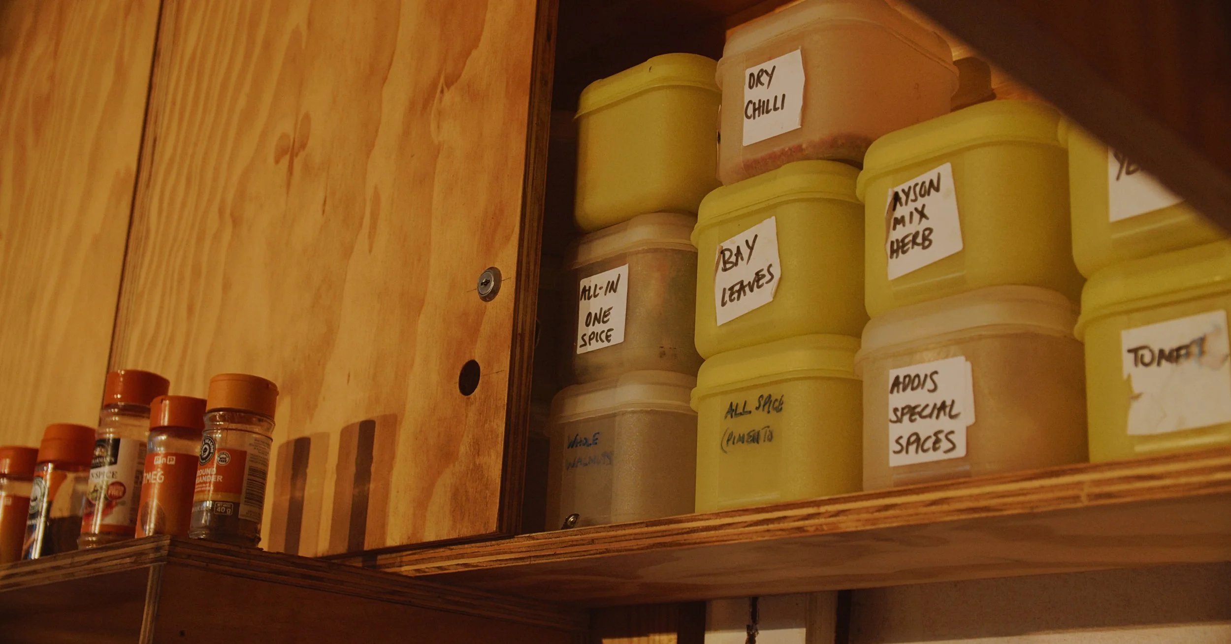
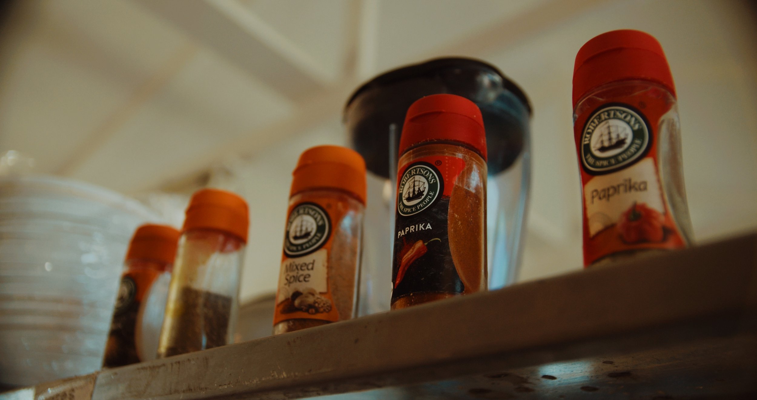
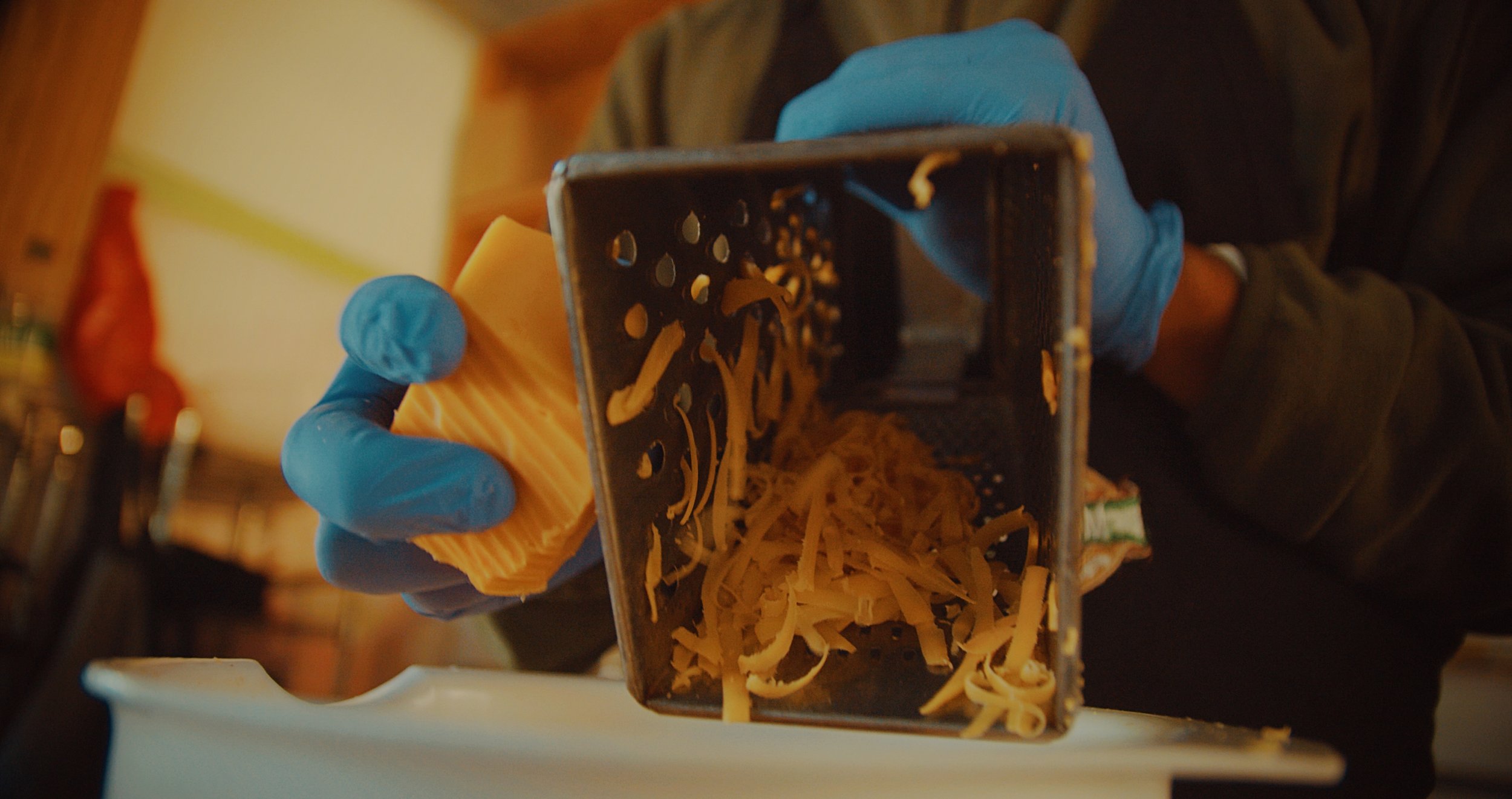
For example, orange stimulates appetite, so during Lockdown Lunch Club we placed little hints of orange all around the kitchen and graded the footage warm. Shout out to Tony and the team for the patience and letting me get deep into that idea lol. But that’s the thing. Color choices like that may seem small, but they can completely shift how a scene lands emotionally.

_________
Here are four unconventional color schemes I’ve been playing with lately, that’ll make you look at your frame a little differently.
1. Dusty Gold + Deep Teal

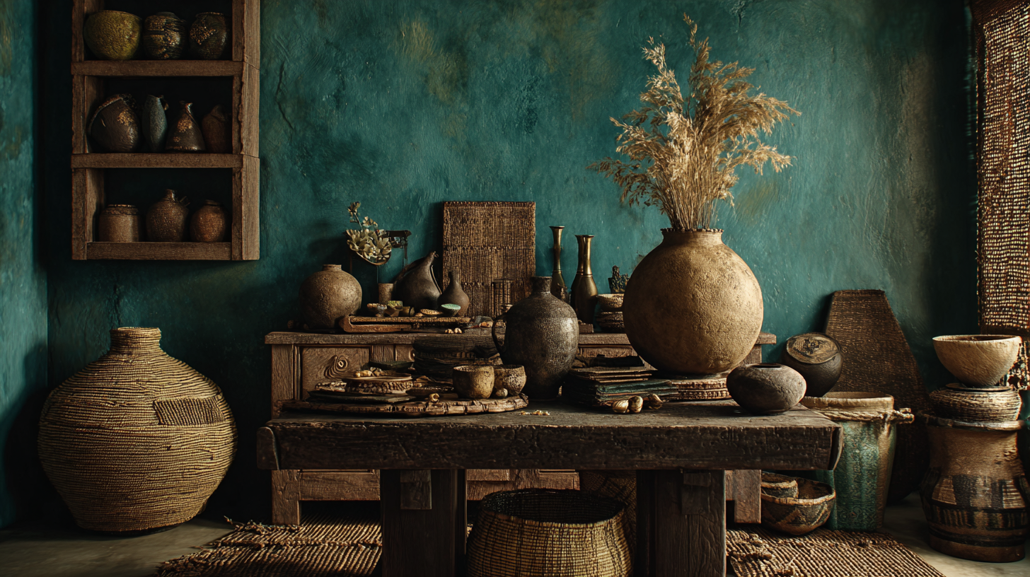
Think heritage, richness, and history.
Dusty gold brings warmth, memory, and a sense of legacy. Deep teal adds calm, depth, and sophistication. Together, they feel rooted and elevated at the same time.
This combo works beautifully for portraits, legacy-driven storytelling, and projects exploring ancestry, tradition, or cultural continuity.
2. Burnt Orange + Slate Blue
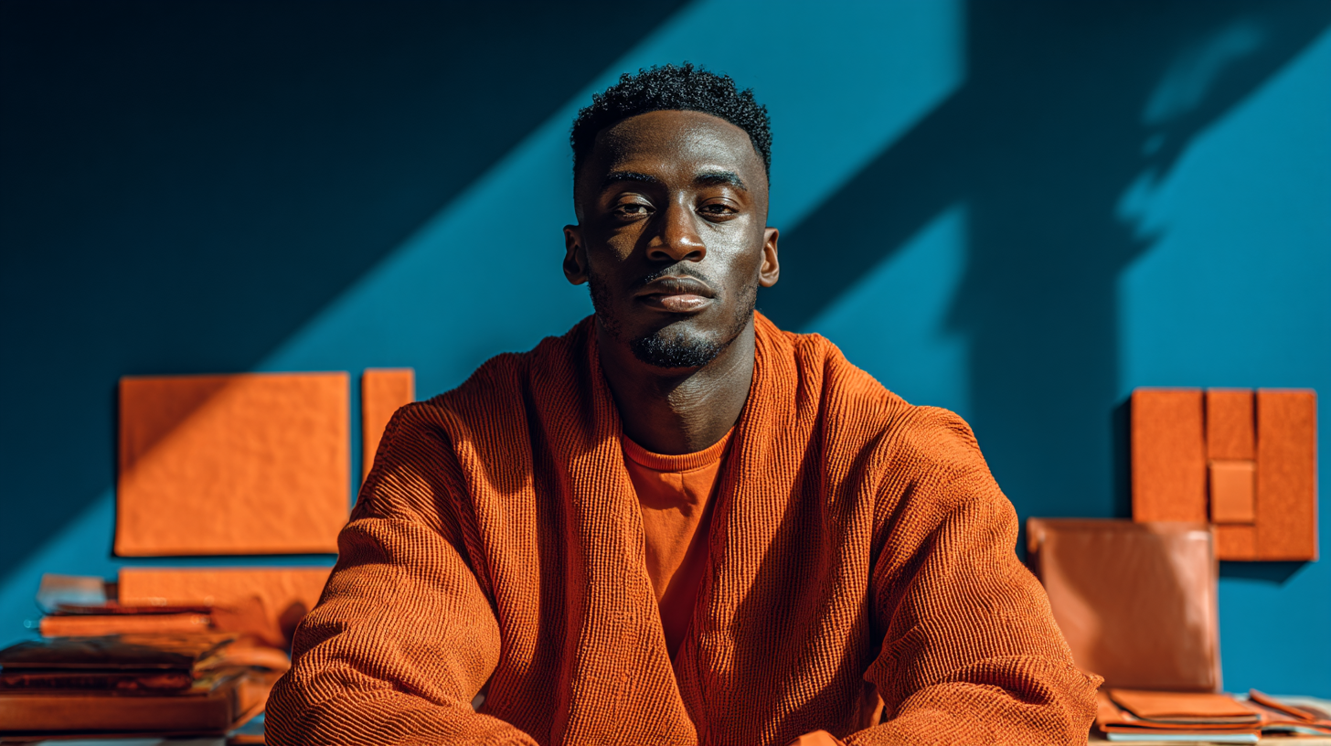
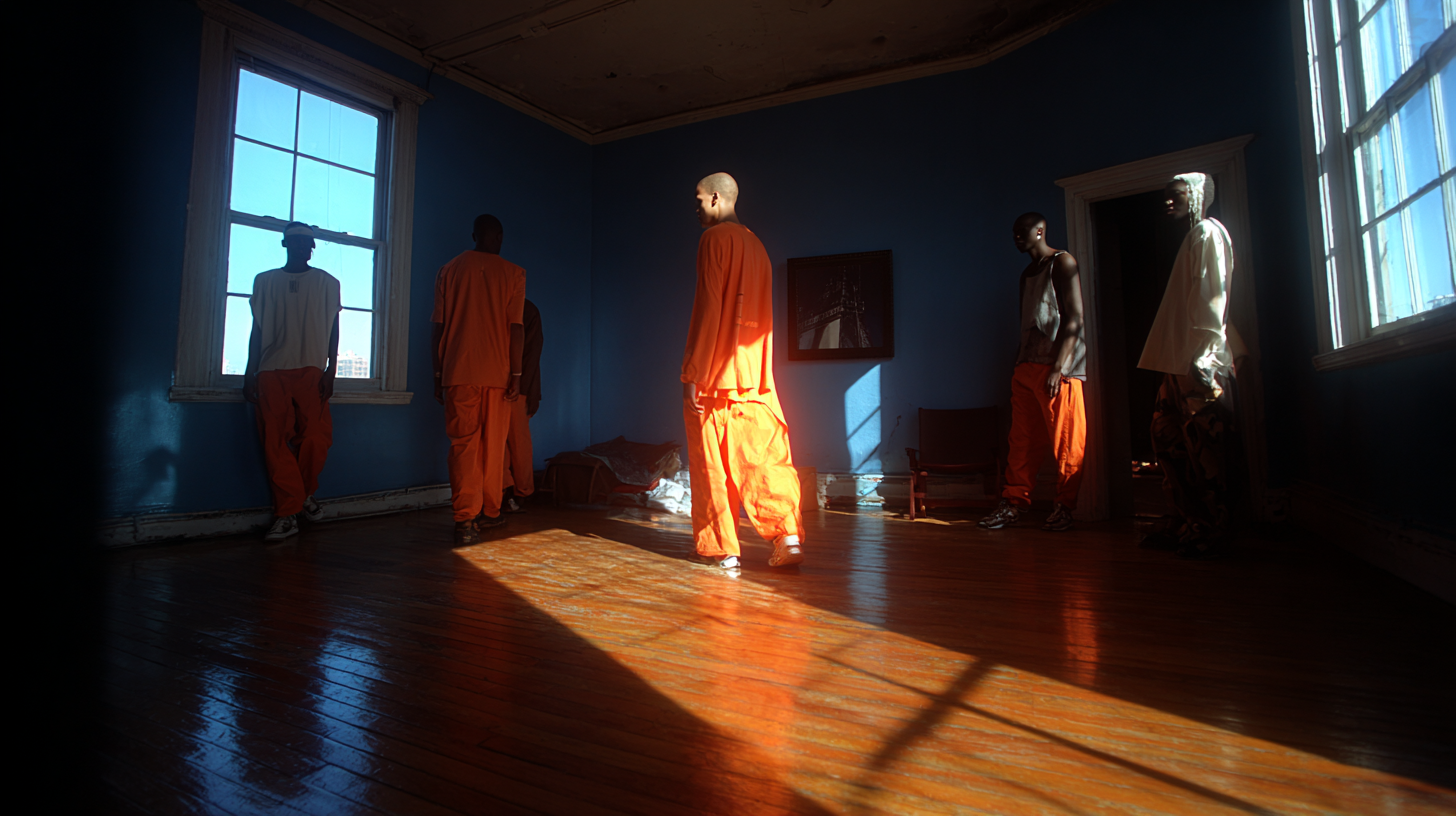
This one has life in it.
Burnt orange feels energetic, human, and alive. Slate blue keeps it grounded. So instead of the palette feeling chaotic, it feels balanced.
I love this combination for stories about younger communities, new ideas, and people doing extraordinary things with limited resources. It carries both motion and steadiness.
3. Muted Pink + Olive Green


Soft, earthy, and a little unexpected.
This pairing has tenderness in it, but it still feels grounded. It’s playful without becoming too sweet, and vibrant without screaming for attention.
I’ve used this kind of balance in work centered around women-led initiatives and creative spaces in communities. It brings in a subtle freshness that still feels thoughtful.
4. Lavender + Mustard Yellow
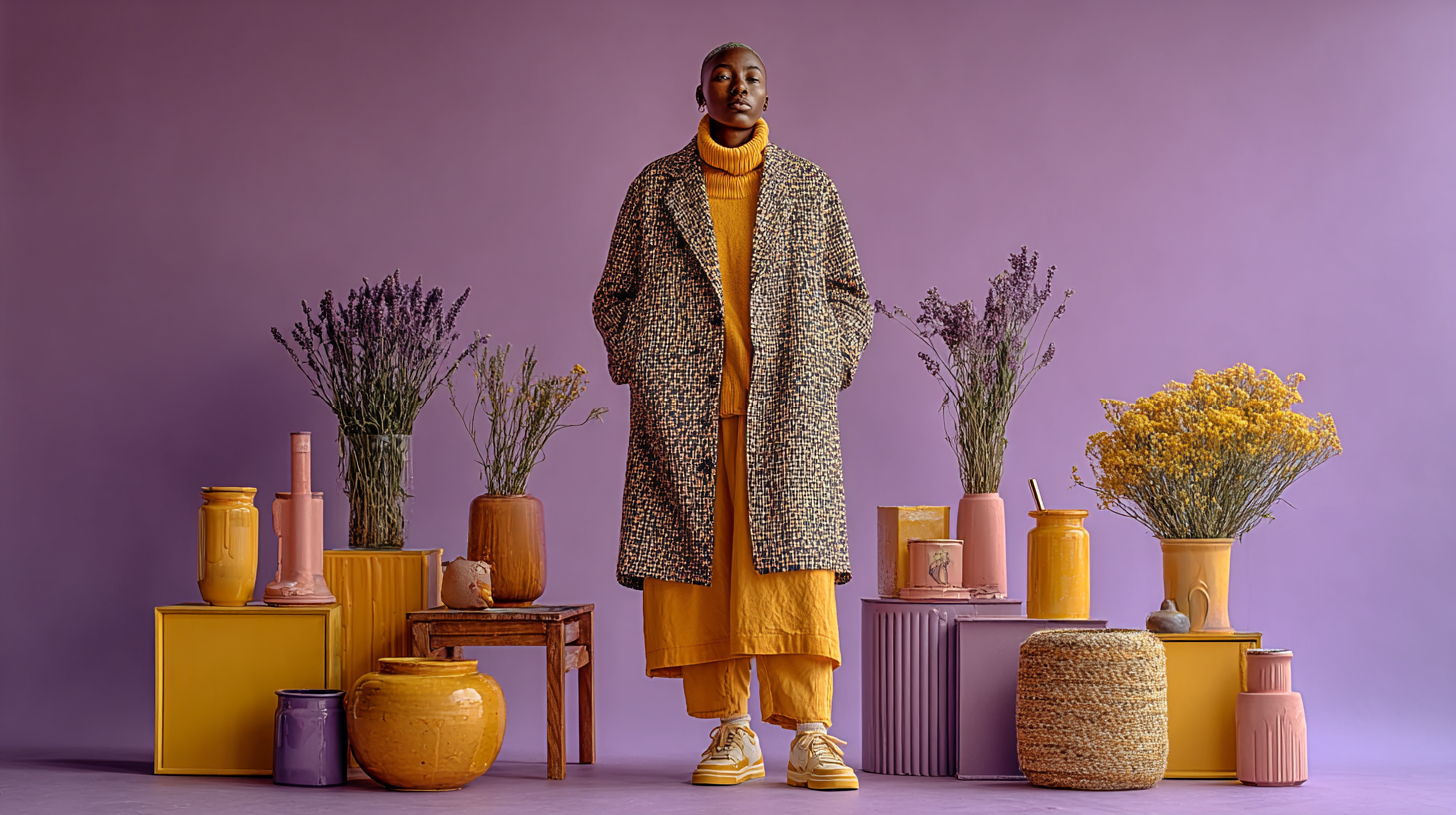
Gentle, surprising, and full of possibility.
Lavender can feel reflective, soft, even spiritual. Mustard yellow adds optimism, warmth, and a little friction. Together they create a palette that feels hopeful, inventive, and slightly off-center in the best way.
This is a great combo for stories about creativity, resilience, hopeful innovation.
Why This Matters